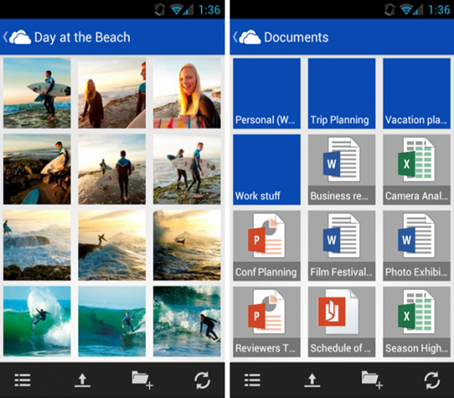
After the launch of the new Outlook it was only a matter of time when the rest of Microsofts web-based services are going to get the new ‘’modern UI’’ as Microsoft calls it after it was forbidden to call it Metro UI. So, after Outlook the turn for a redesign is on SkyDrive, and soon Calendar.
So the same look that was original on the Media Center, then Zune, Windows Phone and on the end on Windows 8 are hold pretty tight by Microsoft and they realy intend to keep it. The new look of SkyDrive, the personal cloud storage is now ready for millions of users.

The developers aren’t left out of the circle too.
The old users who were already using the free 25 GB of cloud storage are going to be realy happy with this new simple design and the new syncronisation between devices is as simple as ever; between a computer and smartphone or other devices everything is fast and smooth.
One sidenote the new SkyDrive is not available for everyone but it suposed to be within a 24 hour timeframe. Also some restriction involving file tipes that can be uploaded are removed and uploading full resolution photos is now also supported.


0 komentari :
Post a Comment